

Having the skill to design your own graphics, without always turning to a designer, can be really handy. While a professional may be good for the big things and getting you started, having to ask your designer for help with every little thing, may not always be ideal.
I see a lot of business owners trying to tackle their own graphics, be it for a banner, a promo graphic, something for social media or an ad campaign.
They may have hired a designer to create their logo, chosen colours and fonts.
But they want to tackle some of the day to day small graphics on their own. It saves money and it is a handy skill to be able to whip things up on the fly when ideas strike or an event or opportunity suddenly comes up and you want to get the word out.
There are a few mistakes I see these people make though. Sometimes they are just a few simple tweaks away from a really well designed graphic. Often the trouble lies in things looking unbalanced, poorly executed, dated, not well-considered or even a little bit ugly.
Fortunately, the ability to design can be taught. While some people have a more natural eye for design. They are often following the basic design principles subconsciously.
When I was in Fashion School, I had a teacher who made us create posters that represent each of the elements of design e.g shape, colour, pattern or line. We would then have to critique and discuss each students poster in depth. This went on for weeks, and to some may have seemed pedantic and a little frustrating, with how much she made us analyse the very basics principles of design. But despite the fact I later decided Fashion was not for me, those lessons became my biggest take away from my Fashion school experience, as those same principles were the foundations of Graphic Design. The teachers I had, really ingrained in me the importance of really truly understanding the basics, and the importance of passion and not seeing limitations as roadblocks.
So if you feel limited by your untrained design eye. Do not let that stop you. If you want to get better at designing for yourself, you can do it, and it starts with getting better at the basics and having a keen understanding of their importance.
There are 3 main mistakes I see come up for DIY designers. Often when I help someone fix their design or give them pointers, I find that often huge differences and improvements can be made, by addressing these three things and getting them right. There is no reason you can not design something aesthetically beautiful and effective for communicating your message.
Use the Grid and Alignment.
Something I see a lot of people do when they have no design training or basic knowledge, it simply placing all the elements on the page based on eye alone. They are simply guessing and putting things where they think they look good. They play around with the layout all by eye and don't use anything to guide the placement of elements.
Back when I was in high school, I remember working on the documentation for a project I was working on and wanting it to look nice, I tried to emulate the layouts I saw in magazines. I didn't understand why they worked or how the designer came up with the layout. All I knew was that it looked good and made the content look organised and easy to read and follow.
So when I first learnt about the grid, I was a little mind blown. It was one of those 'oh it all makes sense now' kind of moments.
The idea of the grid is that before even starting to lay images and text on a page, you first lay out your grid. And then everything needs to align with that.
Now it doesn't need to be a full-on grid, like the maths paper. But rather columns and rows. How many lines you put in your grid, will depend on how much content you are trying to organise and how you want to 'cut up' the information into chunks. The basic structure should be columns (with gutters for spacing) and your baseline (for text and horizontal alignment).


(Screenshots from the old thegridsystem.org)
A bit like building a house. Creating a grid first is like the house frame. It is so much easier to put everything where it needs to go once that frame is in place. Otherwise, you might have a brick wall in one place and your plumbing off somewhere else, and it all ends up a big mess.
For example. If you have a header, 2 paragraphs of text and an image. Then dividing your page into two columns and using a top guide for the top of the header and top of the image, will make a huge difference to your layout. Notice in the bottom image from 'the grid system' above, that not every bit of content needs to fit in every column. You could have text that stretches across 2 columns, and then your image fits just into one column. But because everything on the page is based on the grid, it all lines up and comes together neatly. This is especially important with large amounts of content, that can easily get confusing.
The key with grids is consistent spacing. All columns need to be the same with, all the horizontal baselines need to be evenly spaced and all column gutters should be the same. Things can always break out of the grid, but only with the intention to create attention. So do not feel constrained by it, but use it as a guide and framework for cleaner better design.
Below is an example of how the grid improves the design and how it even helps you experiment with layouts.

Font Choice
Perhaps I am a bit of a font nerd, and typography lover, so I am more sensitive to bed font choices than most people. But another very common mistake I see DIY designers making is poor font choice. Often people are choosing fonts simple based on their personal favourite fonts, what seems trendy right now or just what they can find for free. These reasons for picking a font are not a great criteria.
When choosing fonts here are some things you SHOULD consider:
- What feeling are you trying to create? Do you want it to feel elegant and sophisticated, or fun and playful?
- Who do you want it to appeal to? It isn't just about what you like, but what appeals to your target audience.
- Where can I source quality fonts? There is a reason free fonts are free. While not all the time, some free fonts can be poorly made. If you don't have the budget to buy fonts, be sure the fonts you choose are still quality. Google fonts is a good place for free quality fonts. You can also get nice low-cost fronts from Creative Market. If you want to use the fonts already on your computer, picking more classic old fonts will always look more quality e.g Garamond or Arial.
- Strange kearning. By this I mean the spacing between letters. Something I see a lot of people does that bugs me, is adding letter spacing to script fonts. Script fonts that were designed to flow together, as a script. Spacing can be effective in design, but it needs to be used on the right fonts, fonts that are not designed to flow and connect with each other.

Consider Hierarchy
Whenever you design anything. There needs to be a considered hierarchy. While some things may be obvious, such as your header/title needs to be bigger than the body text. Many DIY designers don't plan out the hierarchy of the rest of the design. It is important to consider the flow of how you want someone to view and read your design.
So yes your header needs to be the biggest text. But what else needs to be considered. Do you want someone to look at your image first, or the text first? Do you want your call to action to be the last thing they see, so they get all the info first before taking action? What order do you want them to look at the images in?
Creating the hierarchy is not only about size, but also the use of colour, and the layout. You need to be leading the eye. The eye will naturally be drawn to whatever you make the focal point of your design first, and then you lead it through the content in the right order.
For example, if you want your viewer to first make eye contact and a connection with you, then read your headline, then read the body text and finally click that call to action. Then you need a nice big smiling front on shot of you to be the focal point, followed by the header in a large text and bold colour, but without standing out more than the image of you, then a readable size body text. With your call to action at the bottom of the page. Maybe your copyright or business name very small right at the bottom, in a lighter colour, so that it does not distract from the content but marks the design as belonging to you and brands it.
When using photos, also consider how the image leads the eye. Which way is the person facing, what are they looking at, what are the objects pointing toward, what is it leading you toward. You want to lead the eye to the content, not away from it. Want someone to sign up for your email list? Then have a picture of you looking at the sign-up form, not looking off the page at the ground.
If you focus on the wrong things or make too many things similar so that there is no clear hierarchy, it will make your design confusing and people won't know what they should be looking at first and in what order. Remember you only have a short time to capture someone's attention, so it needs to be very clear and easy for them to take the information in, without them feeling lost or confused.

I hope these tip help improve your designs, and you keep them in mind next time you create a graphic for you business or blog.
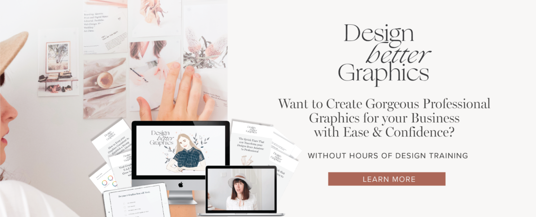
Want to Learn More about Designing Graphics with Confidence?
No more spending hours agonising over a graphic. Start designing confidently.
Before learning graphic design, I would pour over magazines and copy layouts.
Design felt like a mystery.
How did they come up with these layouts? How do they make it look so good?
It looks simple and easy but I can’t pull off work like that.
While I experimented a lot, I wanted to know the secrets to design.
Once you understand the principles, rules and process of design, it all falls into place easily.
You can create designs that look good quickly, and can more easily spot why something feels off about a design.
You can design with intention and have greater confidence in what you are doing.
Being able to design for yourself, doesn’t require a fancy design degree or expensive software
or even someone telling you you are good enough or creative enough.
You simply need to know what you want to communicate,
and the rules of design to help you put it together in a simple cohesive way.
Learn more about my short course Design Better Graphics
I'd love to hear from you
Come join me on Instagram to chat more about this! You can comment on a post or send me a DM and let me know your thoughts or ask a question.
.png)
.png)
.png)
.png)


